

The BeerSmith Icon Enhancement & Revision (BIER) Add-On is a complete set of 140+ new, completely unofficial icons for BeerSmith homebrewing software. The BIER icon set has a simple, flat, material design inspired theme that is intended to enhance the overall experience of using BeerSmith. Of course, it’s based entirely on my own personal preferences. Should you so choose, you can also use the approach detailed below to further customize the icons to suit your own aesthetic.

Installation: To add BIER to your copy of BeerSmith, simply download the set of icons from the link above and extract the zip file. Follow the directions below according to your platform:
- For Windows, extract the “icons” folder in the zip file to your BeerSmith directory (which is usually located at “C:\Program Files (x86)\BeerSmith3\icons\”). You’ll need to replace the existing “icons” subdirectory in the process, so you may wish to back them up first to give you the option of easily returning to the stock UI.
- For Mac, click the BeerSmith app icon and click “Show Package Contents”. Go into “Contents”, then “Resources”. Backup the current “icons” folder there, then copy the icons folder you downloaded to this location. (Thanks /u/SlayterDevAgain from reddit for Mac install instructions!)
That’s it!
Compatability: BIER was designed for the Windows version of BeerSmith 3 and has been tested on Windows 7 and Windows 10. Please let me know if you try it out on additional platforms with success or failure!
Note: Many of the icons in the BIER Add-On are either from or inspired by The Noun Project, a creative commons resource for royalty free icons. See the list at the bottom of this page for more information on which artists helped make BIER possible.
Since the demise of BrewToad last December, I’ve been in the market for a new brewing software. As a casual brewer, I was averse to anything subscription-based, but I was also hesitant to spend time porting recipes into a free service that could go the way of BrewToad and … well, croak.
Enter BeerSmith. I had always heard good things about its capability, I liked its one-time licensing option, and its local installation / local recipe storage guaranteed that I could keep everything around for as long as I wanted to use it (Note: BeerSmith does have cloud storage options for convenience, as well). So, I decided to give it a go.
My first impression was one that I’ve seen echoed elsewhere:

If you’ve heard one thing about BeerSmith, it’s probably that it’s powerful. If you’ve heard two things about BeerSmith, the second is probably a criticism of its outdated UI. While a flashy interface is secondary to what’s under the hood, there’s still something to be said for user experience and how icon design can help or hinder a software’s workflow. For many of BeerSmith’s icons, it’s obvious that time and care went into designing them, but some compounding issues with the overall implementation can unfortunately detract from a very capable tool.
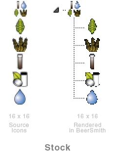
Stock BeerSmith 3 
BeerSmith 3 with BIER Add-on
But, I was happy with BeerSmith otherwise. So, what else is there to do but spend hours customizing its look? Modding is Life!
Before I get into the details, I do want to be clear that I’m not out to disparage BeerSmith’s stock icons. It’s a real possibility that my taste is horrible and I’m making everything objectively worse. That’s the joy of customization! More to the point, in most cases within BeerSmith, it’s not a question of the icons’ quality, but with how they’re displayed or how they scale to smaller sizes. Let’s investigate…
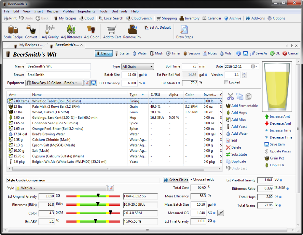
Designing for Scale
As an example, consider the grains:

At 48 pixels square (BeerSmith’s maximum icon size) we have some perfectly fine stalks of grain. There’s some shading and a black outline that helps it stand out on both light and dark backgrounds, but we start running into issues when we reduce the resolution. At 16 pixels square (BeerSmith’s minimum icon size) most of the detail is lost, the colors blend into a dark brown mess, and it looks more like a chicken foot than anything you’d want in your beer. In the third version on the right, you can see a further loss in quality when the image is limited to full transparency only, which we’ll discuss in a minute.

Now, let’s look at the grain icon in BIER to see what we can do differently. For the grains, we start with a wheat icon by Alice Design from the Noun Project. It’s a simple design, and it renders clearly both large and small. There’s only one color, and the lines stay fairly sharp even at 16 pixels across. Consequently, we have an icon that is quickly identifiable and maintains its structure when scaled.
Transparency and Anti-Aliasing
Next, let’s get back to that transparency issue. Just to complicate things further, the BeerSmith UI for Windows has a glaring rendering issue with icons in the tree and list widgets. The icons look as you would expect if you open up the file externally, but they render poorly within BeerSmith itself.
After some experimentation, I realized this was an issue with transparency support. For some as-yet-unknown reason, the list and tree widgets only support full transparency (i.e., a pixel is either solid or invisible). Meanwhile, the source icon files are designed with an alpha channel that supports a full spectrum of partial transparency (translucency) from 0% to 100%. This translucency is critical in anti-aliasing the icon enough to look decent at 16 pixels wide, but due to this issue, any partial transparency is ignored and those pixels instead appear invisible. This is the reason the icons end up looking jagged and lumpy in lists and recipes.
As far as I can tell, this issue is limited to the 16×16 icons in the list and tree widgets, but that’s a fairly large percentage of the icons you’ll see in BeerSmith (recipes, ingredient lists, etc.). Correcting this would go a long way to improving BeerSmith’s UI, but that’s beyond what we can do by just replacing the icons. However, what we can do is design the 16×16 versions of our icons with this issue in mind to minimize the impact it has on the UI.

To combat BeerSmith’s Flawed Architecture for Rendering Transparency (hereafter referred to as FART), I modified the 16×16 versions of the replacement icons to remove translucency. This primarily consisted of putting the icon onto a white background and manually selecting which of the translucent pixels should be made fully transparent and which should be turned opaque by merging with the white background.
Depending on the icon and the colors involved, this can produce a white matte around the icon. Fortunately, it’s not usually noticeable in BeerSmith since the list and tree backgrounds are white even with the darker themes enabled. It can sometimes be seen when an item is highlighted, or in limited cases where an icon is used on a dark background, such as in the calendar. C’est la vie, that’s the best we can do by modding PNGs.

The Goals of BIER

(% of icons using color)
The two issues above were the core problems I tried to solve with the BIER add-on. In doing so, I also tried to adhere to the following principles:
- Minimalist icon designs that are clearly recognizable at 16 pixels or 1600 pixels, matching and mirroring each other wherever possible.
- A limited color palette. Altogether, BIER uses about 18 colors to keep the icons as simple, stark, and cohesive as possible.
- A tailored set of 16×16 icons specifically adjusted to mitigate the aforementioned transparency issue as much as possible.
Customizing Your Own Icons
“But wait!” you say, “I hate what you’ve done, and I’d rather make my own icons for BeerSmith!”
Well, I have some good news for you. With enough blood, sweat, and pixels, you sure can! If you take a peek into BeerSmith’s icons folder, you’ll see that its icons are saved as PNGs in four different sizes: 16, 24, 32, and 48 pixels square, plus an additional set at double those resolutions. The double resolution set is labeled 16@2x, 24@2x, 32@2x, and 48@2x (corresponding to 32, 48, 64, and 96 pixels). I wasn’t able to determine where, how, or if the 2x icons are actually used, but I replaced them all anyway for completeness (the same is true for a handful of icon designs that seem to be vestigial or for unimplemented features).
Of course, you may balk at the idea of resizing and saving over a hundred different icons eight times each, especially if you keep tweaking the designs and need to regenerate all 8 files every time. Well, balk no more, for automation shall prevail!
If your image editing software has batch processing, that’s one solution. Personally, I opted to write a Python script that finds all PNG files in a directory and uses Pillow, a fork of the Python Imaging Library, to generate the eight sizes we need with their appropriate filenames. Every time I made changes to the icons, I ran the script to generate the complete set and port it into BeerSmith.
import os
from PIL import Image

dir1 = "D:\\BeerSmith Custom Icons\\Full Size"   # Source Directory
dir2 = "D:\\BeerSmith Custom Icons\\Resized"     # Output Directory

# List of Sizes to Generate for Each Image
outSizes = [(16,16),(24,24),(32,32),(48,48),(32,32),(48,48),(64,64),(96,96)]

# List of Strings (Added to Base Filename) for Each Size
outNames = ['16','24','32','48','16@2x','24@2x','32@2x','48@2x']

for fileName in os.listdir(dir1):
    if fileName.endswith(".png"):

        img = Image.open(dir1 + "\\" + fileName)

        for i, outName in enumerate(outNames):

            img_out = img.resize(outSizes[i], Image.BICUBIC)
            img_out.save(dir2 + "\\" + fileName[:-4] + outName + '.png')
That’s all there is to it. Design each icon at a convenient size larger than 96 pixels (the size of the “48@2x” file), then run the script to generate all the necessary sizes of all the icons. Lastly, fine tune the 16×16 icons to keep them looking sharp despite the rendering issues in the list and tree widgets.
What Exactly’s in the BIER Add-On?
If you want to scope it out before you download it for yourself, here’s some more examples of what’s in the pack and how it looks once you add it to BeerSmith:

I replaced the beer and wine color scales with a new nonic pint glass & wine glass of my own design. Having found that my recipes in BeerSmith were a smidge off from the color I expected, I made small tweaks to the colors used in the icons for each SRM value (new scale shown to the right, along with red and white wine colors). Of course, if you want to adjust it further, you can do so by simply changing the filenames of the icons.
BeerSmith also conveniently has an option labeled “Use New Beer Glass Icons” option under Look & Feel Options > BeerSmith Color Theme. The BIER add-on will replace the new icon set, but not the old. So, when this option is checked and BIER is installed, you’ll see the glasses above, but you can also uncheck it to revert to BeerSmith’s older stock pint glasses.
Lastly, here’s just a few examples of BeerSmith with the BIER add-on (left) and without (right):

I hope that you find the BIER pack useful and enjoy the new streamlined look in your BeerSmith life. It was a fun project to tackle. Cheers!
Made Possible by The Noun Project
This project uses some original designs in concert with a variety of icon styles from The Noun Project either as-is, with some color adjustment, or with other modifications. In any case, many thanks and credit to the wonderful designers of TNP who made the BIER icon pack possible:
Appearance by Ayub Irawan
Apple by Lyhn
Arrow Left by Mike Rowe
Binoculars by Kiran
Bubbles by Rudez Studio
Calendar by Adrien Coquet
Carboy by Mark Caron
Check by Focus
Clock by Yo! Baba
Cloud by Humantech
Copy by Mochammad Kafi
Dollar by Musmellow
Flag by Vectors Point
Floppy by Markus
Folder by Saifurrijal
Gauge by Alexander Skowalsky
Gear by Humantech
Globe by Piotrek Chuchla
Heart by Ben Iconator
Home by Frey Wazza
Honey by Styleku
Hops by David Lamm
Key by Kyle Dodson
Magnifying Glass by Vectors Market
Measuring Cup by Jake Park
Monitor by TS Graphics
Note by Benny Forsberg
Options by Marie Van den Broeck
Package by Kokota
Paper Bag by Arthur Shlain
Paperclip by Zulfahmi Al Ridhawi
Paste by Omar Safaa
Pillow by Milko BG
Pint Glass by Mark Caron
Plus or Minus by Muneer A Safiah
Print by Georgiana Ionescu
Profile by ghufronagustian
Puzzle by Bluetip Design
Scissors by Icon Lauk
Shopping Cart by Adrien Coquet
Thermometer by Guillem Sevilla
Tools by HrBonPro
Undo by Farrel Putra
Vial by Arafat Uddin
Vials by Yo! Baba
Warning by Gregor Cresnar
Water by Bluetip Design
Weight by Styleku
Wheat by Alice Design
Window by Icon 54
Wizard by Ralf Schmitzer
X by Fardan

I was able to get them to work in BeerSmith 2 on Ubuntu Linux 16.04. I just copied the new icon files into the icons directory. The hardest part was finding where in filesystem the BS files were living (/usr/share/BeerSmith2) It looks SO much better with these icons, thank you!
LikeLiked by 1 person
Anyone figured this out on Mac?
LikeLiked by 1 person
Yes, it should work! I just updated the post with instructions for Mac courtesy of /u/SlayerDevAGain on reddit: click the BeerSmith app icon and click “Show Package Contents”. Go into “Contents”, then “Resources”. Backup the current “icons” folder there, then copy the icons folder you downloaded to this location.
LikeLike
Brad should hire you!
LikeLike
I just tried this on Ubuntu 18.04 LTS and it worked like a dream with BeerSmith 3. As mentioned by another poster the files were found in /usr/share/BeerSmith3/icons. You’ll need root or admin access via sudo to modify the directory and files but other than that. Easy-peasy. Thanks for taking the time to make this, it’s very much appreciated!
LikeLike
Thanks for testing it out and sharing the file location. Glad you like it!
LikeLike